
Fundamentals of communication design
Spring 2018
Typographic Movie Poster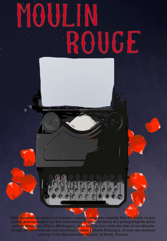
February 2018
|
Prompt
Select a film to research and watch outside of class, and then design a typographically-driven poster to promote the movie. The content for the poster will be inspired by the film. Because movie posters already exist for all of these movies, it's prohibited use the existing logos or typefaces that are already associated with the film. Use alternative typefaces to convey the feel of the film. Design Decisions
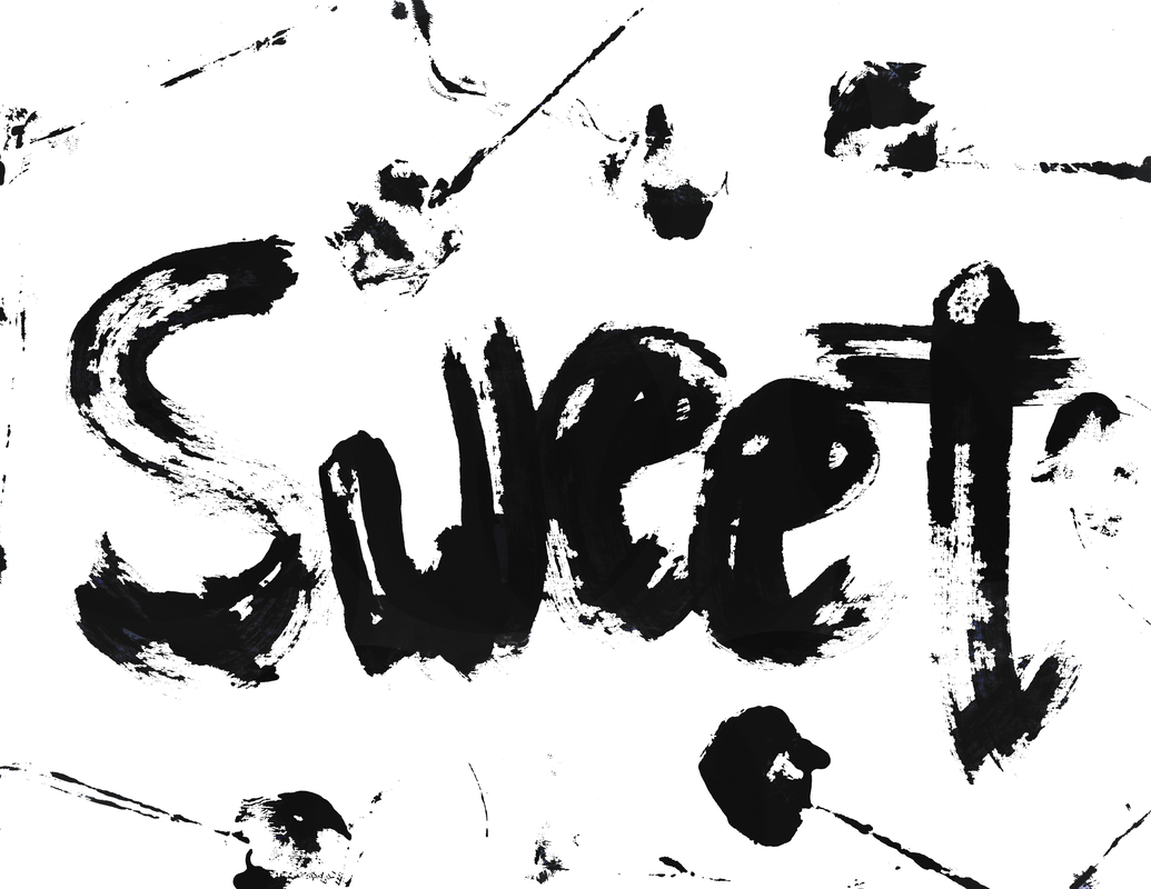
I chose the movie Moulin Rouge to reinvent for it is not only my favorite movie but I feel as if the original artwork seems to be the only one out there and I wanted to redo it with more of a twist and to focus on overlooked symbols seen in the movie. In order to not copy the original known cover I decided to focus more on the underlying theme or just a portion or scene in the movie. I then decided to use a typewriter motif to symbolize christian and the story about their love. I then surrounded the image with rose petals to enhance that aspect and also bring up the ending scene of Satine’s final moments. As far as fonts go I chose a typewriter character for obvious reasons and to describe the production information to symbolize their story being all in type. Finally for the main title I decided to base the typography off of of the actual Moulin Rouge in Paris instead of just a marquee or 1900s theatre-esque font. Although due to font limitations I had to produce the text myself by hand which could have been done more cleanly. As a final foreground I based my color choice off of the clouds in the scene where Your Song is introduced. In total I really wanted to emphasis smaller details of the movie making the poster seem both mysterious and romantic. |
|
Parameters
Search the web to find an image of the city and then use Photoshop’s type tools to set the city’s name in a typeface that evokes the mood you’re trying to communicate. Design Decisions
I chose Barcelona because I had visited the city last semester during my fall term abroad and although a little crazy it was one of my favorite places. I feel as if Barcelona has a very strong energy that’s both hectic and exciting. To show I gathered an image of the well know Casa Batlló that I had taken myself on a quality Nikon DSLR. I chose this image because not only is it one of my favorite buildings but it also give a great sense to the culture by the unique art nouveau style and vivid colors. To further enhance I made my image into a mosaic in photoshop for the architect, Antoni Gaudí, is very well known for his use of mosaics (Hence Park Guell, also in Barcelona). I then placed the city’s name where it felt compositionally appropriate and used a teal found in the building. Although the font itself is not like the typical subway art nouveau characters, I felt as if it meshed well with the feeling of the city and created some simplicity in the hecktic image. |
Insta-Cities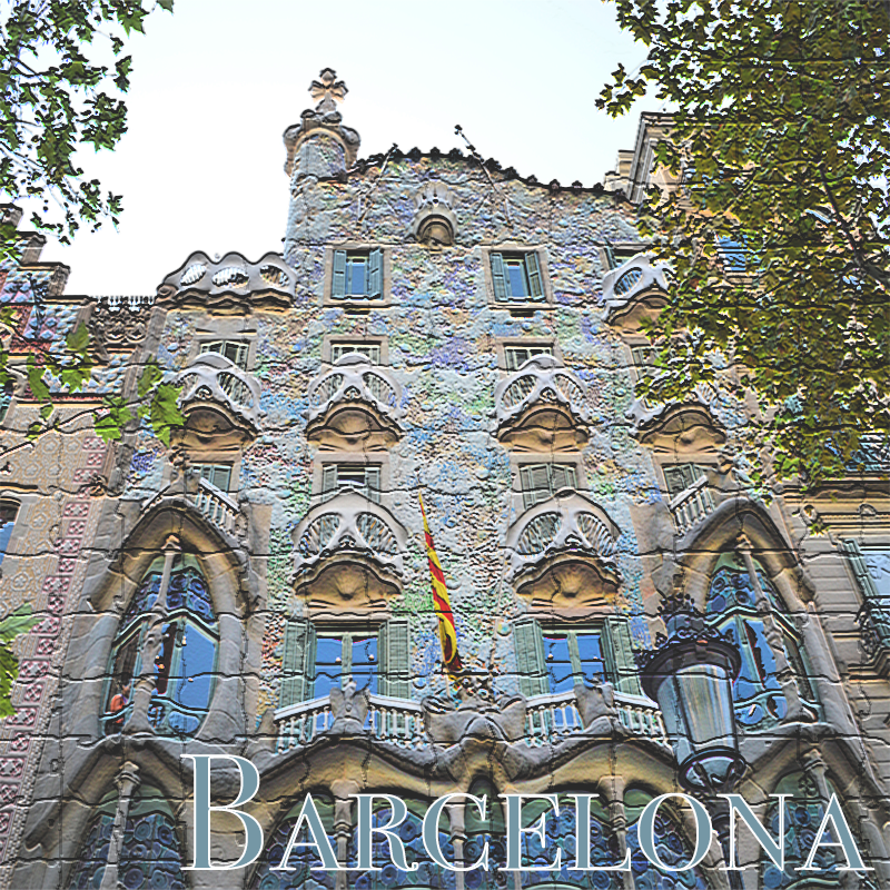
February 2018
|
|
Photoshop CompositionFebruary 2018
Objective
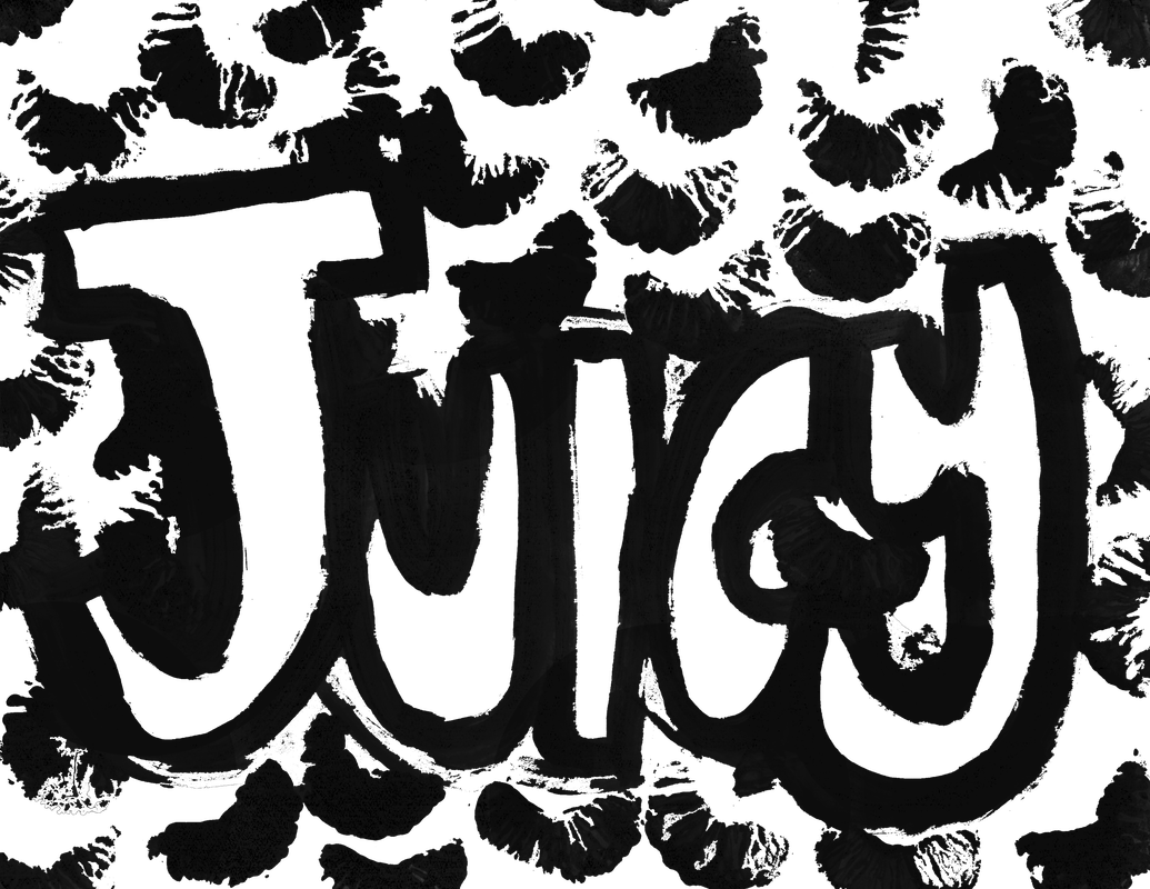
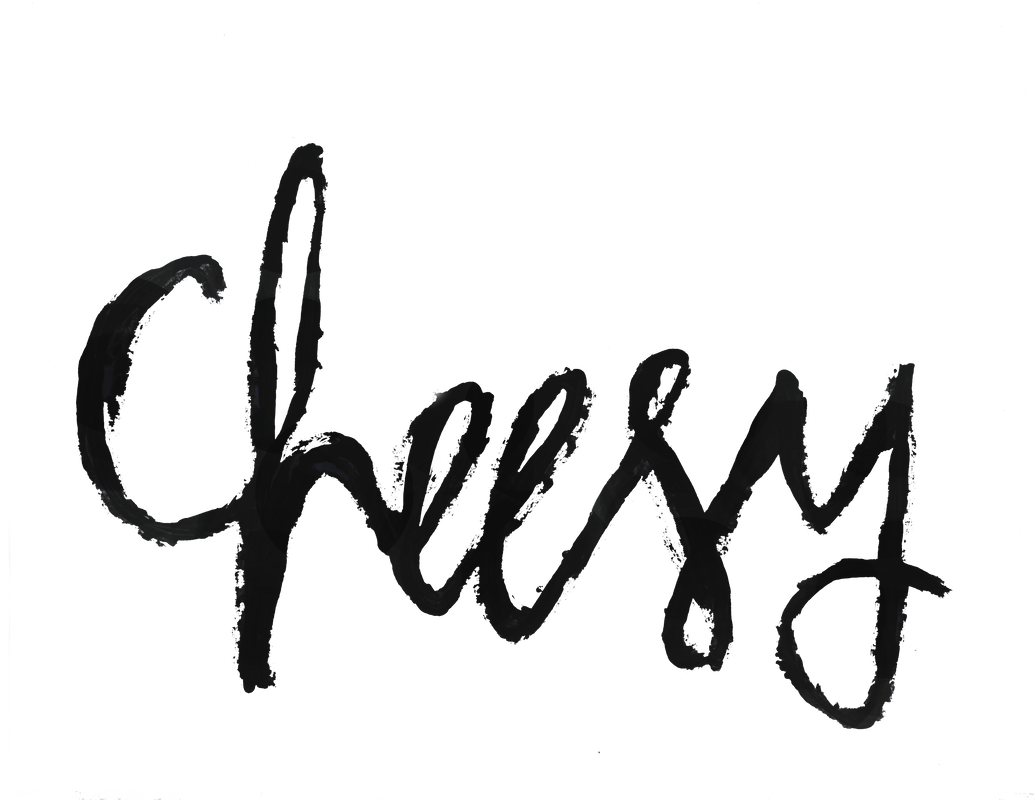
Create an other-worldly image in Photoshop that combines image parts from multiples sources. You’ll capture images with your own camera/smartphone and use layers in Photoshop to copy and paste image parts into a combined image. Feel free to experiment with filters, painting tools, and other aspects of Photoshop. Design Decisions
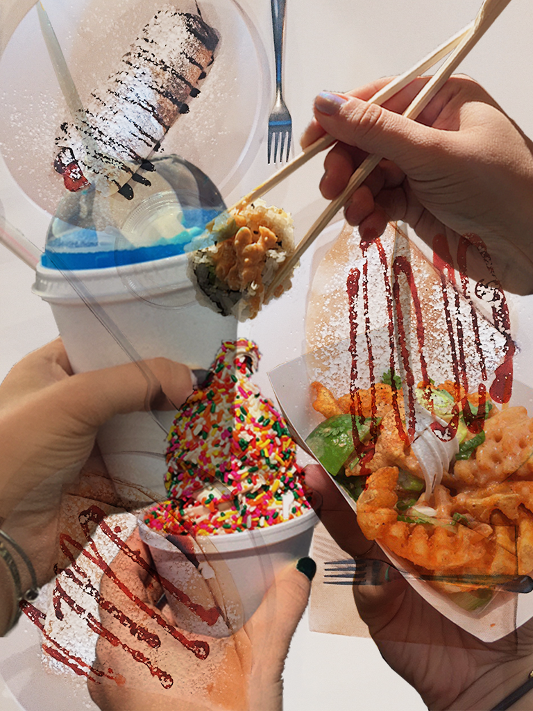
To practice with photoshop I decided to collage a handful of photos holding food into one whole image. I played around with transparency and brightness and overall found my composition to be both fun and interesting. |
|
|
|
|
|
|
|
|
A Dignified Purpose - Ty Miller
She loved to steal spoons. She didn't need them; she just enjoyed having a hundred tiny silver mirrors to see what no one else could Fooled Again - Jonathan Carroll
She was like certain colognes: they smell beautiful at first, but then the aroma disappears in half and hour Polygamy - David Joseph
I miss her more than the others |
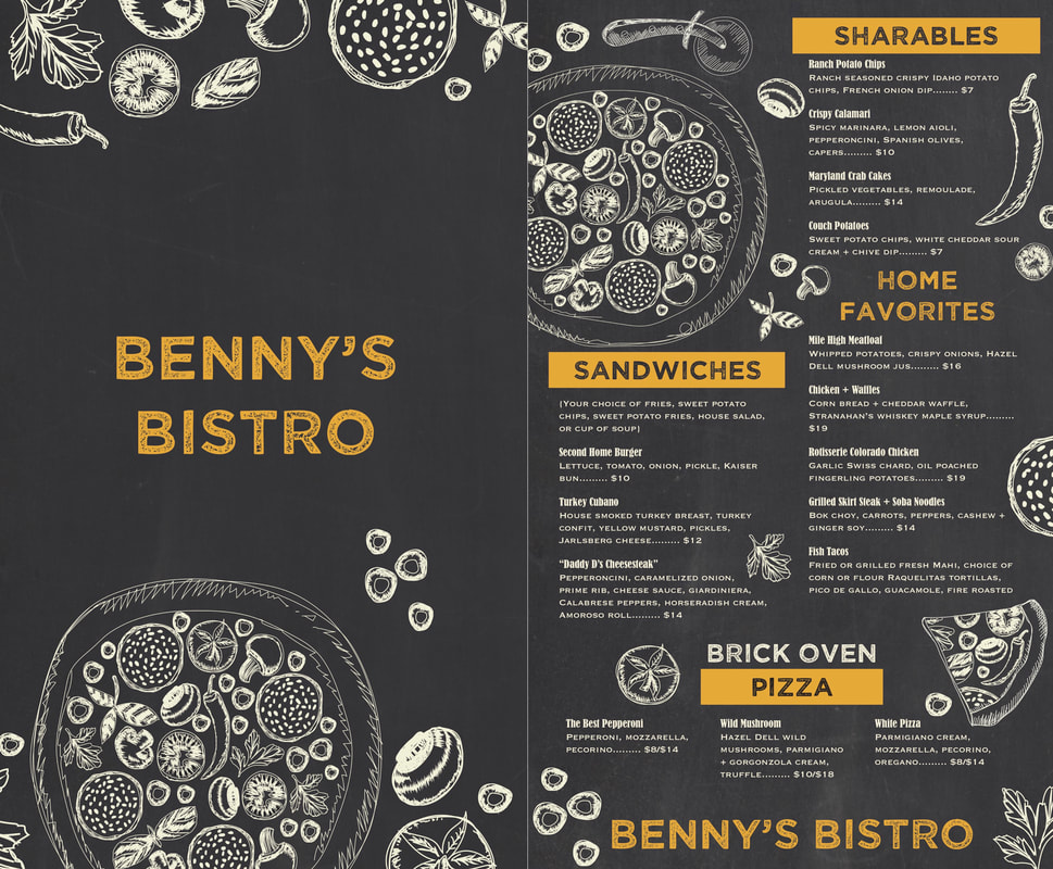
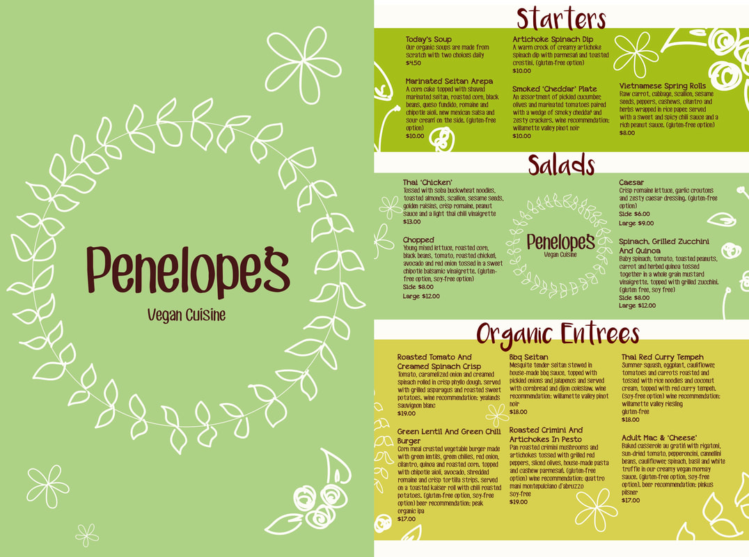
Menu Designs |
April 2018
|
|
|
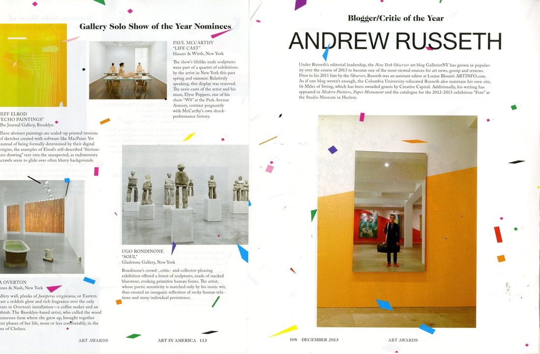
Article Rebuild |
April 2018
|
|
|
May 2018
|
Magazine/Editorial DesignObjective
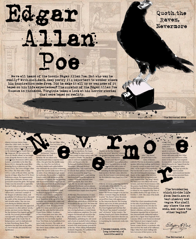
In this assignment, you will design and produce two spreads of a magazine article about an influential personality, communicating a memorable concept through strong imagery, solid typography, and well-considered page layout. Editorial design for Edgar Allan Poe
Design Decisions
When given my prompt my mind immediately drew to his work, The Raven. Although it's not always best to go with your first idea I felt the need to explore it for the idea excited me greatly. I then went about drawing the raven using illustrator, finding a type written like font for the pull quotes and "Nevermore," and then went about rearranging my pages. I also included the faded images in the background after much critique to add depth to the articles. The top are illustrations from his poems and the bottom is of a feather to represent the spill of the ink from the first page. Overall I had a lot of fun designing this spread and it really helped me understand magazine layouts. |
